Near & Far Magazine
BACKGROUND: Near & Far is a travel magazine for the modern traveler, issued monthly. The task was to design a travel magazine for millennials between 25 to 40 years of age that is beautiful while being full of travel inspiration and useful tips. This project focuses on typography, page layout, and photography.
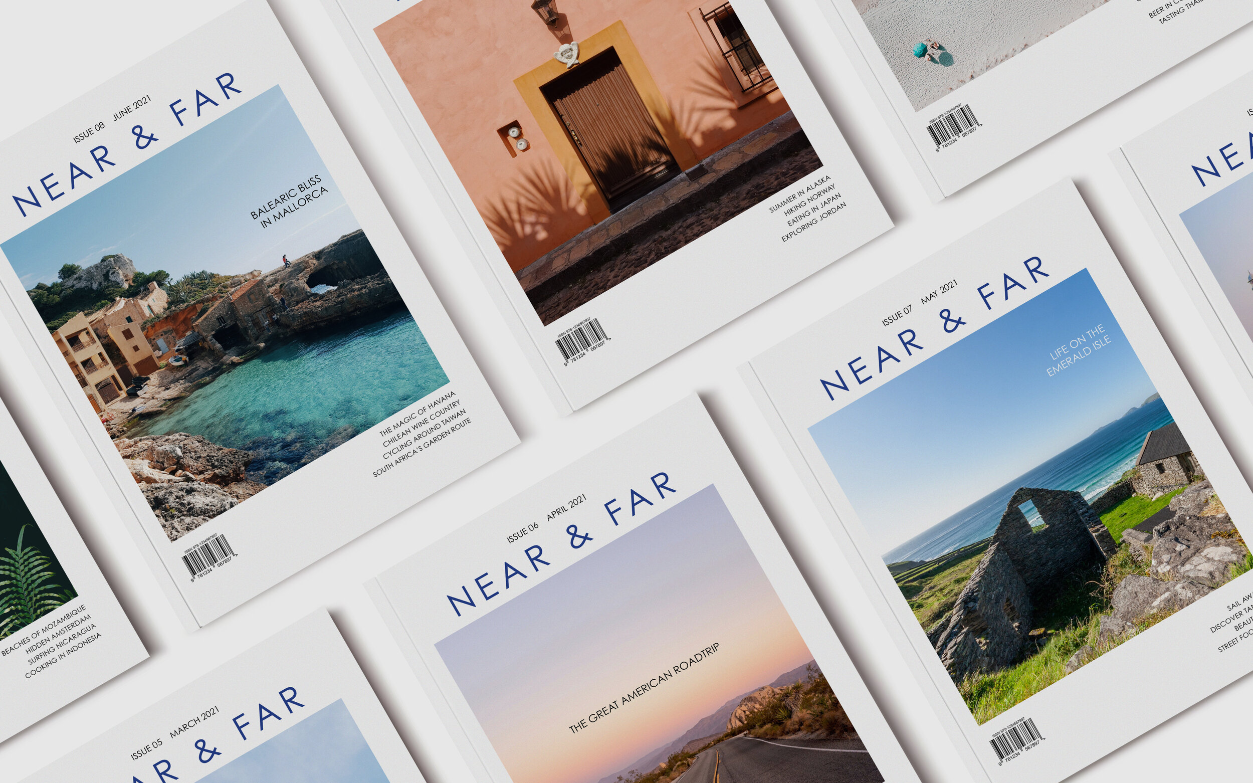
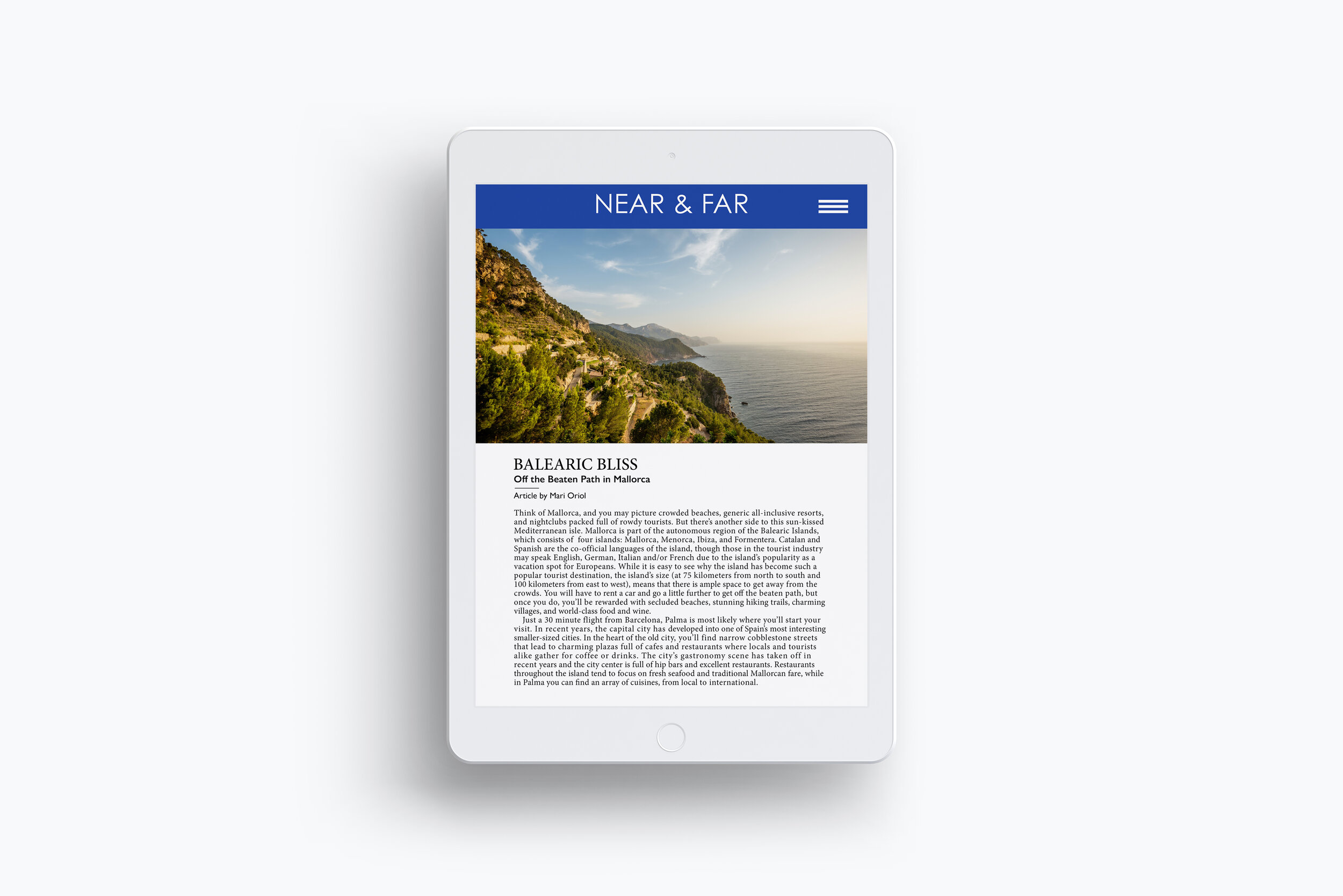
DESIGN PROCESS: I began looking at travel photography on Unsplash and magazine layouts on Pinterest and Behance for inspiration. I chose the deep blue color for the logo based on a picture of the Mediterranean sea that I came across. This color is also used in other places throughout the magazine. For the logotype and main typeface, I selected Century Gothic. For the main article I featured, I chose Minion Pro as the primary typeface, with Gill Sans used as a contrasting typeface for the headings. When laying out the document, I opted for a 12-column layout, which gave me flexibility when designing individual stories to change the size of the text boxes and images to fit the layout. When creating a tablet version, I kept many of the same design elements and photos, but simplified it somewhat for this version.
DESIGN SOLUTION: The magazine layouts are all focused on high quality images while using white space to draw attention to the content of the articles. The result is an aesthetically pleasing, modern magazine that works well in print or on an e-reader/tablet.
SOFTWARE: InDesign, Photoshop